God School Lesson 1

User avatar
LAYF
Discussion Moderator
Posts: 7100
Location: 5 degrees to the north of the first point on the last square!
Contact:

Re: God School Lessons: #2

Post by LAYF » Tue May 28, 2013 6:22 am

Nerre wrote:Here is my little treasure lair. Beware of the invisible guardian dragon. Click to see it a full size.
It took me about 30 minutes to do that.

Image
Nice look on the gold Nerre, and i like the shading to, keping it in "stages" (no idea how to say that in englich correct) gives it a nice had painted look...

Layers? are the plates, crosses and such layers or?
-Best regards LAYF

Nerre
Game Master
Posts: 4876

Re: God School Lessons: #2

Post by Nerre » Tue May 28, 2013 6:35 am

Thanks. Each of the mayor color shades you called stages is one layer with default transparent. Then I added the two-color items like the coins, swords, plates and cups into the layer of the regarding color.

I was lazy, so only the first two colors got overlays with items. :D
:zzz:

User avatar
thinkslogically
Game Master
Posts: 17223
Location: Florida

Re: God School Lessons: #2

Post by thinkslogically » Tue May 28, 2013 6:36 am

That's really awesome stuff Nerre - it looks great :)

User avatar
LooksAndSmiles
Game Master
Posts: 1364

Re: God School Lessons: #2

Post by LooksAndSmiles » Tue May 28, 2013 7:36 am

1. Nerre has made a cave with a big pile of treasure
2. Dragons like big piles of treasure
3. Bob has a dragon.
4. Nerre has expressed interest in riding said dragon.

...

IT'S A TRAP!
Inventing forum games since '10 ...
Skill Table Cheat Sheet for my players in the Minesweepers game.
Random dragons I help growing up:ImageImageImageImage And my own dragons are here. The hatched ones like the clicks! :D

Nerre
Game Master
Posts: 4876

Re: God School Lessons: #2

Post by Nerre » Tue May 28, 2013 7:39 am

► Show Spoiler
:zzz:

User avatar
M0rtimer
Global Moderator
Posts: 14109

Re: God School Lessons: #2

Post by M0rtimer » Tue May 28, 2013 7:40 am

You're a god mate! Make one! :roll:

User avatar
LAYF
Discussion Moderator
Posts: 7100
Location: 5 degrees to the north of the first point on the last square!
Contact:

Re: God School Lessons: #2

Post by LAYF » Tue May 28, 2013 8:22 am

^ True that, true that... ^
-Best regards LAYF

Nerre
Game Master
Posts: 4876

Re: God School Lessons: #2

Post by Nerre » Tue May 28, 2013 10:42 am

to early, this is not the lesson for creatures yet. ;D
But maybe I will repeat lesson 1 and create a nice dragon who fits well to my avatar. :D

A little hint to make things look smooth: Work in an image twice the size you need, and only shrink it once you are done. Some kind of auto-anti-aliasing. But this won't work if you use lines with width 1.
:zzz:

User avatar
LAYF
Discussion Moderator
Posts: 7100
Location: 5 degrees to the north of the first point on the last square!
Contact:

Re: God School Lessons: #2

Post by LAYF » Wed May 29, 2013 12:24 am

WhirdCheese wrote:Image

The Cheese invites you to his castle. He wishes you enjoy your stay and not press the self-destruct button. Also don't mess with the guards. Touch them and they'll kill you.

Total Time: Made over the course of three days.

Question!

Did you invent the royal cheese meal? if so, can you make burger king in Denmark get it back on the menu... i miss it :P
-Best regards LAYF

User avatar
Ratha
Whispers Softly
Posts: 49

Re: God School Lessons: #2

Post by Ratha » Wed May 29, 2013 2:31 am

LooksAtYouFunny wrote: :) proberly thinking of LooksAndSmiles, may people confused us in the start when I signed up, calling us both Looks.... ThatÔÇÖs why that wn first time someone called me LAYF, I adopted it right away :)
That makes sense. Now THAT is a name I definitely remember.
Nerre wrote: Image
Holy crap, more art to study. That is one convincing pile of gold. Do you have any specific process for how you did the fine details of that pile?
He has returned, one of the great old ones, and has caught up on goblins, still thinking "Holy Sonuvacrap! PsiMinMax!"

Nerre
Game Master
Posts: 4876

Re: God School Lessons: #2

Post by Nerre » Wed May 29, 2013 3:48 am

I created one coin object, then copied it very often. I created 3 groups: 1 with a single coin, one with about 5-6 and one with about 25. Then I used those, slightly changing the rotation angle and put them onto the layer until most of it was covered. Then I startedthe same with the next layer. If you look close enough, you will see that the orientation and pattern repeats itself on some spots. :)
After the coins I added the other items to spice it up a bit.
:zzz:

User avatar
LooksAndSmiles
Game Master
Posts: 1364

Re: God School Lessons: #2

Post by LooksAndSmiles » Wed May 29, 2013 4:31 am

Nerre wrote:I created one coin object, then copied it very often. I created 3 groups: 1 with a single coin, one with about 5-6 and one with about 25. Then I used those, slightly changing the rotation angle and put them onto the layer until most of it was covered. Then I startedthe same with the next layer. If you look close enough, you will see that the orientation and pattern repeats itself on some spots. :)
After the coins I added the other items to spice it up a bit.
A nice trick with Gimp to "copy" something often: Simply select it, and press Ctrl+C or Ctrl+V. Aside from it going to the clipboard, you will notice that it will also appear as the very first item in your brush palette. Then all you have to do is to select your brush/pencil tool and paint away! Then you can also set some cool effects like random tilting or splattering, and so on, much easier than manually duplicating and working on them 1 by 1.
Inventing forum games since '10 ...
Skill Table Cheat Sheet for my players in the Minesweepers game.
Random dragons I help growing up:ImageImageImageImage And my own dragons are here. The hatched ones like the clicks! :D

User avatar
thinkslogically
Game Master
Posts: 17223
Location: Florida

Re: God School Lessons: #2

Post by thinkslogically » Wed May 29, 2013 5:10 am

LooksAndSmiles wrote:A nice trick with Gimp to "copy" something often: Simply select it, and press Ctrl+C or Ctrl+V. Aside from it going to the clipboard, you will notice that it will also appear as the very first item in your brush palette. Then all you have to do is to select your brush/pencil tool and paint away! Then you can also set some cool effects like random tilting or splattering, and so on, much easier than manually duplicating and working on them 1 by 1.
That IS a very nice trick! Thanks L&S!

Nerre
Game Master
Posts: 4876

Re: God School Lessons: #2

Post by Nerre » Wed May 29, 2013 9:56 am

A cool, didn't know. Maybe I should install gimp. But on work I can't. :(
:zzz:

User avatar
LAYF
Discussion Moderator
Posts: 7100
Location: 5 degrees to the north of the first point on the last square!
Contact:

Re: God School Lessons: #2

Post by LAYF » Wed May 29, 2013 12:55 pm

Ratha wrote:
LooksAtYouFunny wrote: :) proberly thinking of LooksAndSmiles, may people confused us in the start when I signed up, calling us both Looks.... ThatÔÇÖs why that wn first time someone called me LAYF, I adopted it right away :)
That makes sense. Now THAT is a name I definitely remember.
Nerre wrote: Image
Holy crap, more art to study. That is one convincing pile of gold. Do you have any specific process for how you did the fine details of that pile?

You should take a look in hte recourses thread.. there is A LOT of nice things in there....
-Best regards LAYF

User avatar
Prometheus
Mutters to Themself
Posts: 28
Location: Denver, Colorado
Contact:

Re: God School Assignments: #2

Post by Prometheus » Wed May 29, 2013 4:44 pm

I'm having a serious problem Uploading images which have less than completely Opaque layers. When it gets to Imgur it shows them as being fully opaque and i have no idea how to fix it. Any advice/Help?

User avatar
madmartin26
Indulges in Conversation
Posts: 895

Re: God School Assignments: #2

Post by madmartin26 » Thu May 30, 2013 12:23 am

Did you save it as a .PNG first?

User avatar
thinkslogically
Game Master
Posts: 17223
Location: Florida

Re: God School Assignments: #2

Post by thinkslogically » Thu May 30, 2013 12:41 am

Prometheus wrote:I'm having a serious problem Uploading images which have less than completely Opaque layers. When it gets to Imgur it shows them as being fully opaque and i have no idea how to fix it. Any advice/Help?
Everyone, please let's keep all questions & answers in the lesson thread, not in here!

Saying that, since you need 2 files anyway (you should save your .xcf file with all the layers intact first), when you come to save your .png file, just flatten the image. Select the top layer and then go to layers > merge down until you're left with one. Export the flat file as a .png (DO NOT OVERWRITE YOUR .XCF) and give that a try again.

(M0rt - can you shift these Q&As over to the lesson thread again for me please? EDIT: THANK YOU!)

User avatar
LAYF
Discussion Moderator
Posts: 7100
Location: 5 degrees to the north of the first point on the last square!
Contact:

Re: God School Lessons: #2

Post by LAYF » Thu May 30, 2013 3:55 pm

BeanDip wrote:Image

"So here's my lair. Death is so dark and dank. I wanted sunshine and happiness!

There was an apple tree here... until I tried to pick some fruit off of it and it died.... but I tied a pretty ribbon around it so it's okay now, I guess. The sun was smiling on us until he burned to death and there was lots of screaming. I planted tulips but they aren't doing as well as I thought. There were bunnies too but well.... not so many bunnies now...

My favourite part was the unicorn! I petted it as soon as I made it! And then it died a horrible death. I felt pretty scummy so I brought it back. Undead is technically alive, right?"
► Show Spoiler

Hehe, I really like the story behind your lair bean, nice and creative...
-Best regards LAYF

User avatar
BeanDip
Resident of Sacred Statue Garden
Posts: 2455

Re: God School Lessons: #2

Post by BeanDip » Thu May 30, 2013 4:18 pm

I just died from happiness :greenie: :greenie: :greenie: :greenie:

Seriously, the fact that anyone likes anything I created makes me feel like I could explode into confetti and streamers at a moment's notice. Thanks. :)
NOTE TO ALL THOSE I AM GAMING WITH: Currently gaming with others in the Sacred Statue Garden.


Signature changed by request of MrsBeanDip by Wolfie

User avatar
M0rtimer
Global Moderator
Posts: 14109

Re: God School Lessons: #2

Post by M0rtimer » Thu May 30, 2013 4:37 pm

I liked all entries so far! Including yours. :)

I'm just saddened by the fact I'm not going to be able to post my entries for a while yet... I'm not going to put the required time in this though while I have exams to be working for.I'll play the catchup game once exams finish...

User avatar
BeanDip
Resident of Sacred Statue Garden
Posts: 2455

Re: God School Lessons: #2

Post by BeanDip » Thu May 30, 2013 5:06 pm

And I'm certain that we'll all be blown away. :D
NOTE TO ALL THOSE I AM GAMING WITH: Currently gaming with others in the Sacred Statue Garden.


Signature changed by request of MrsBeanDip by Wolfie

User avatar
GathersIngredients
Discussion Moderator
Posts: 5147

Re: God School Lessons: #2

Post by GathersIngredients » Fri May 31, 2013 2:21 am

I really liked your entry, too, BeanDip. (In fact, I have yet to see an entry that I don't/didn't like! You guys are ALL awesome!) How did you get the clouds to look that fluffy? Did you use a special brush or something?
And, yeah, I know how you feel. My heart seemed to skip a beat when thinklogically (I mean, seriously, THE thinkslogically who continues to run FOUR games at the same time and manages to make all of them pretty to look at and add some really nice, enthralling story to it, with relate-able to characters, too!) complimented little ol' me on my donkey.

Prometheus, how did you make the Forrest floor and the foliage of the trees in your second picture?
Krulle wrote:My bad memory allows me to enjoy positive news far more often!
Excited for the Dungeon Eyes, Ricki and Lara kissing!
► Show Spoiler

User avatar
thinkslogically
Game Master
Posts: 17223
Location: Florida

Re: God School Lessons: #2

Post by thinkslogically » Fri May 31, 2013 4:59 am

Good morning folks! I know the deadline isn't until later tonight for the assignments, but I'm disappearing this evening for the weekend and Arles is taking over for a couple of weeks so I wanted to take the opportunity now and just say a massive THANK YOU to you all for participating so far. The entries you guys are posting are awesome and I'm loving the creativity!

Anyway, I would also like to take this chance to post a couple of my own comments regarding what's been posted so far:
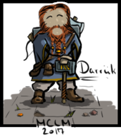
1. Ratha

Image

Really nice 2D lair in the sprite-game style! I love how your avatar is evolving and the pattern in the portal. How did you make the pattern? Is that a paint-bucket pattern or a brush? Nice use of detail too on the items and the portal surround. The only suggestion I might have is to watch your scale. I know your avatar can float, but that desk seems pretty big in comparison to him, at least to me. That's a really minor detail though, otherwise it looks great!

2. GathersIngredients

Image

I really do love the donkey! This is also really nice - you've kept the colours simple, but warm and I really like how you've used the gradient brush and the clouds to give a bit of depth to your image. The artwork is simple, but it is perfectly clear exactly what everything is supposed to be. If this was the opening scene for a game, I'd say it's pretty spot on. It's got enough detail to give your players options, but it's simple enough that they won't be investigating every single stray pixel on the offchance it's important. The only suggestion I might make is that it's a little unclear what the gradient behind the hut is representing. To me it looks a bit like a dust-storm because it's darkest in the centre, but you might want to add some extra spin-lines to make that clearer. If it's a sunset, you need to reverse the direction of the gradient so that the centre is the lightest. Other than that it looks awesome :)

3. madmartin

Image

Another great freestyle drawing! I love the ship, and again it's nice and simple. The positioning of your sprite on the far left makes the image feel a bit unbalanced to me, and it feels like there should be something on the ship's deck. From a game perspective though this is great if you intend to have the players collect loot and fill the ship with cool stuff, because they'll look at the picture and immediately think 'huh, that boat looks empty, I'd better fill it with things'.
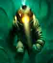
4. Prometheus

Image

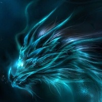
There is beautiful use of colour and brush-style in this image to really give a feeling of quiet, solitude and other-worldliness. Without the torches, this would be quite a forboding sort of location, but the fire and sunbeams make it feel safe. Again, very simple style, but conveys the atmosphere very well. The only thing I might suggest is to try and lighten the pool and rocks a little. If they're being lit by the light-beams from above I might expect them to be a bit lighter than they are. You could also try some basic shading on the rocks - if you choose a darker shade of grey and then colour in approximately the lower half of each rock you might help emphasise the illumination a bit. Similarly to give that feel for the torches, you could create a new layer & paint it completely black. Drop the opacity to something that still allows the background to be dark but visible then use the eraser (with opacity around 10-20%) to paint circles around the torches. This will remove the darkness from around the flames and will make them appear brighter than the rest of the image. I did something similar in this image from the sign-ups:
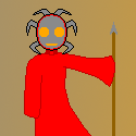
► Show Spoiler
5. LAYF

Image

Another great sprite-style image (though we'd expect nothing less from you!). I love the simplicity and the marketing! I particularly like how you're able to combine simplicity with detail in your images to really make each object significant, and I really like the use of shading on your seals. This kind of style is great for games which may involve more of an investigative aspect - there's loads for the players to look at and pay attention to, and if you included a time limit you could really stress them out! My only criticism is that you've left a lot of blank space in the upper right area. Perhaps having your portals as a single row, or 2x2 grid could fill the space up a bit more?

My favourite thing is the evil watercooler though. He looks like he'd bite the hand off anyone who tried to get a drink :lol:

6. Nerre

Image

Not a great deal going on in this setting, which makes the treasure pile look a bit more like a fancy item or piece of scenery than the entire scene. However, it is a beautiful piece of artwork, and one of the best of the bunch this week! The shading is used brilliantly to give depth to the image and the detail is beautiful. I just wish there was a little bit more in this picture (a ground layer, or maybe a light source to explain the shadows).

7. whirdcheese

Image

Very nice! I love your use of perspective in the throne room and the shading on the carpet to highlight the step. I also like that you haven't used a black outline anywhere in the image except on your sprite which I think helps make it appear more important. The only criticism I have is that the perspective view seems to stop at the door. Giving your guards a little bit of floor space to stand on might just have been enough to make them appear part of your 3D scene. As they are they look a little 2D to me.

8. BeanDip

Image

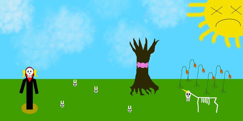
This is hilarious and I love the concept! :lol: All the happy little contradictions are lovely and while your style is quite simple, it again has detail where it's important (the dead grass under your avatar's feet for example) and it's obvious immediately what everything is supposed to be. I would quite like to see some bunny bodies attached to the skulls for completeness, but again, if you started a game like this in this style, right now, I have no doubt you would get a LOT of players having a LOT of fun! Because frankly, who doesn't want to play a game as death-with-ponytails?

------------------------------------

I'm really enjoying seeing what you guys are putting up here and I hope you don't mind my criticisms - they're intended to be helpful! If you guys have any comments of your own to add, please feel free, but let's keep it constructive!

User avatar
LAYF
Discussion Moderator
Posts: 7100
Location: 5 degrees to the north of the first point on the last square!
Contact:

Re: God School Lessons: #2

Post by LAYF » Fri May 31, 2013 6:25 am

So, feedback

First, Thinks, Thanks for taking all the time to give us all feedback, I find it nice and useful :)


So, my feedback:

Ratha

Not much to say that Thinks hasnÔÇÖt said, but 1 thinks that pop into my mind,
I noted that the light from the lamp did not come from ÔÇ£the lampÔÇØ but a bit off, itÔÇÖs a small detail, but... to find something.
Image to show what I mean:
► Show Spoiler
Besides that, I like it, and especially how you character evolves, as Thinks also mentioned.


Gathers
Again, not much to say that was not said already, one thing that did hit me was, YouÔÇÖve taken the time to make 2 different types of grass, even do there is only 2 pieces in total, but the seagulls (or other kind of birds, we cal that ÔÇ£bird formÔÇØ seagull in DK) you have 10 of, and all the same, I think you could make 2 or 3 different, and still keep the style... but it is truly a minor detail.


Martin
It hard to find a thing to say that Thinks has not said, so good job, especially I like how the style is complete (all parts fits together) That said, IÔÇÖm a bit sad that all the image has a nice hand drawn feel o it, yet, the 3 times copied cloud spoils that a little, maybe if you change them just a little bit they would feel more ÔÇ£inÔÇØ the image... (Yea, I noted the seagulls are also a 2 times copy, but there are so many that you have to look to notes)
But great job :)

Prometheus
Hay, welcome to the class :)
Overall a nice mood to your image, and what Thinks said, the only thing I can add is, your light level seems a bit to low, for a place having both light beams and 2 torches lighting it up, when placing a light scours, make sure to use it, unless the whole image is with 1 simple light setting.

Nerre
I think Thinks said most things here, only thing to add is, the ÔÇ£edgeÔÇØ of the gold pile seems a bit to fluid or... soft if you will, to me, besides that, I must echo in with the others, nice image, nice piece of art. :)

Weird
No thing to point that wasnÔÇÖt said, but a question... the lines on the floor? What are they? They disturb my eye a bid, because I want to know what they are...

BeanDip
As IÔÇÖve said, you really made me laugh with this image, and I like it a lot. Only one thing, a little tip maybe, since your un-unicorn is placed sides ways, you might want to move its eyes and nose just a few pixels towards its front.. giving it kind of a side glace look.. and if you want it to ÔÇ£look outÔÇØ of the image, you can add pupils (red or green IÔÇÖd guess in the case of an undead, but thatÔÇÖs up to you) like this:
► Show Spoiler
-Best regards LAYF

Post Reply