
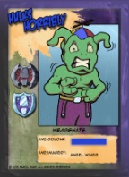
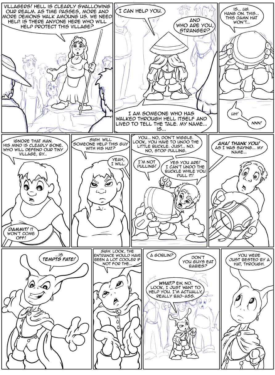
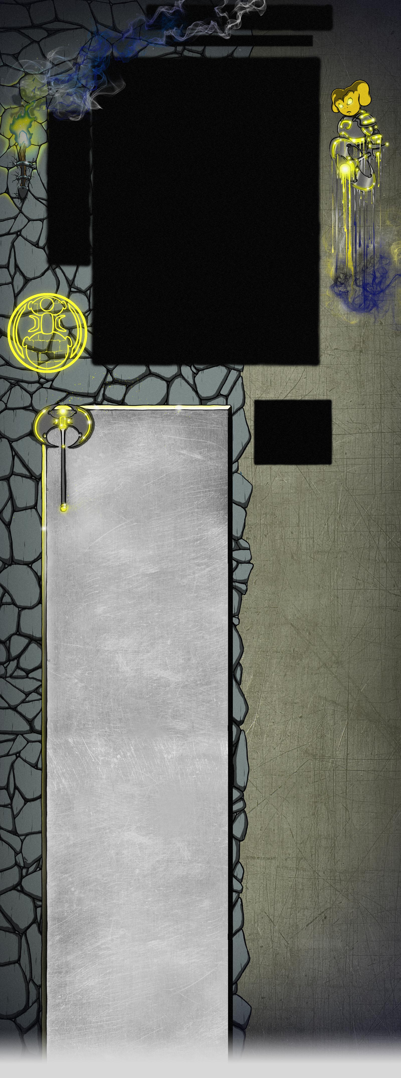
You're talking about the sides where the background image isn't wide enough to fill, right? http://goblinscomic.com/images/mainbg.jpg ? Not knowing what website engine you're using (I assume it's something like Wordpress, but for webcomics), I can only assume that you have full control over CSS and stuff...DragonTurtle wrote:Ooh, argh, yes, I agree! That little black strip has been driving me crazy! I haven't figured out how to get rid of it. >.< But you're saying I should *add* to it. Hmm. Maybe I can do that. I'll give it a try. ThanksBadgeAddict wrote:One other thing I noticed, on the main goblins picture, there seems to be a black edge on either side, but not on top and bottom. This helps create the incomplete/chopped off look. If you add a bit of border to the top and bottom, I think it will look much better.
The easiest answer is that Tarol would have to simply draw the background image wider -- right now it's 1600px wide, and I'm seeing probably 200px of black on either side -- but that brings with it bandwidth issues.
The next option is to stretch the background to fit whatever monitor, with a minimum width so it doesn't get too crazy, via CSS / JS (I see you have JQuery, which opens up all sorts of fun options). The problem there is Ears, the sigil, the torch, and the blog background are all absolutely positioned, on the background image. You'd have to separate each of those, into their own image, and worry about lining them all up, individually, and then you'd run into issues with stretching.
The last option is to just accept it, and draw some sort of border on the edges of the images -- maybe something as simple as fading to black (or alpha... whichever) so the transition to the black edge is less abrupt.


